

Many students ask me about what is a good design. My answer to this common question might be a bit controversial, but it is true! Good design is a C.R.A.P. and we cannot do much about it. Would you like to learn more about this mysterious abbreviation? I encourage you to read this short article and let C.R.A.P. become an important factor influencing your designing processes.
Text and illustrations by Joanna Wróblewska
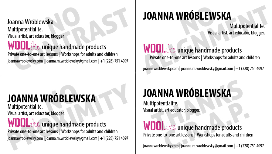
In visual communication, there are many rules to learn. It is hard to decide where to start, so maybe begin with something simple and basic? Robin Williams, who wrote a famous award-winning book “The Non-Designer’s Design Book” promotes the idea of C.R.A.P. in visual communication. It is a set of easy to understand design principles that stand for Contrast, Repetition, Alignment and Proximity. They describe well what is a good, clear and readable design. They also build a certain visual awareness, so let’s say it once again: good design is really a C.R.A.P!
C for Contrast
Contrast is all about a difference in shape, colour, size or texture. Design elements like lines, patches of colour or geometrical figures can be similar to each other or differ quite a lot. In the first case we talk about low contrast, in the second situation we describe the contrast as high. Low contrast is less readable, more blurry, rather calming and static. On the other hand, high contrast makes the design more shouting and dramatic, builds tension and sharpness. In general, if you plan to make a difference you should use contradictions and put design elements in high contrast. Low contrast will support some designs, but it is good to use it consciously.
However, there are also things that should be avoided when it comes to the first C.R.A.P. component. For instance, it is very hard to contrast elements that are similar to each other. A thick line will not be perceived as a strong one, if we place it next to other lines that are just a little bit thicker or thiner. A brown piece of text will not be in a high contrast with black headlines. Exactly the same thing will happen with two typefaces that are quite similar to each other and combined together in one design.

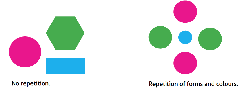
R for Repetition
It is very interesting how repeating noises, words or visual elements emphasizes them. Repetition in visual arts not only creates a certain rhythm or flow in a picture, but also strengthens the visual message. Repeated shapes and colours draw attention and become more visible for the viewer. Many designers see the repetition as a very powerful tool that integrates and unifies the image.
In some cases, repetition can become overwhelming, especially when you use too many elements in the same colour. In fashion, it is called a “total look”. It means that placing a red text with a red headline next to reddish illustrations can be just too much for our eyes! It is the same with shapes or textures. We need a little bit of a balance in whatever we create.
On top of that, repetition should not make your design less readable. Keeping high contrast should help you in avoiding too monotonous repetitions.
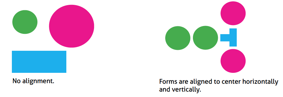
A for Alignment
To align design elements means to order them and organize them on a page or a screen. It means, that a piece of text or a group of objects can be aligned to the right, left, center, the top or the bottom. Whatever you go for, use just one type of alignment. Especially at the beginning, it might be hard for you to deal with more advanced designs, where design elements are aligned differently.
Some designers say that centered alignment is a bit boring, but it is also a safe one. Try not to overuse it, but at the same time dare to experiment with all the possible solutions. Creating two or three visual representations of your ideas will surely help with making the final decision.
P for Proximity
It is all about grouping objects and placing them close or far away from each other. For example, a book title should be placed close to its subtitle. The same on a business card – the contact information should be grouped together to make it clear and readable.
Proximity is all about building relations between design elements and showing what belongs together. This is why it is not well perceived to have many chaotic objects in one piece. Moreover, design elements that do not belong together should be clearly separated from each other. Grouping them might be rather confusing for viewers. On the other hand, leaving big white spaces here and there will disintegrate your design and make it look messy.
Finally, avoid sticking objects or pieces of text in corners. This should not be done in any professional visual material.
Summary
C.R.A.P. is a very convenient designer’s tool that you can apply to all types of visual work. By learning those four basic principles you build a visual awareness that with help you to identify design problems and deal with them on your own. C.R.A.P. will be always on your side.
Learn more:
Using Graphic Design Principles in Web Design
C.R.A.P. Principles of Graphic Design
How to Use C.R.A.P. in Your Design [Infographic]